
Storage benchmark articles share a common tension. The most important evidence on the page is usually a screenshot full of read and write speeds, queue depths, test sizes, and drive names. It is not visually exciting, but it is the factual core of the review.
That does not mean the numbers should stand alone with no visual support. It means they need better context around them.
For an SSD review, upgrade guide, or PC build comparison, the benchmark capture should remain the center of the story. Creative tools are more useful in a supporting role: explaining workloads, building header graphics, and preparing images for different publishing formats. The goal is to make articles easier to scan without turning measured results into decorative fiction.
Keep the benchmark screenshot untouched
Start with the part that should not be generated or creatively altered: the benchmark itself.
If CrystalDiskMark reports a particular sequential read speed, that number needs to appear exactly as recorded. The same applies to the drive name, test profile, capacity, and other settings that affect interpretation. AI editing should not be used to rewrite a benchmark screenshot or recreate a result that merely looks plausible.
Instead, preserve the original capture and build the visual story around it. A reviewer might place the screenshot beside a photograph of the tested SSD, create a cleaner header image, or produce an illustration that distinguishes large sequential file transfers from workloads involving many small random reads.
Build supporting graphics from real source material
Hardware articles often accumulate several useful images over the course of testing: a photo of the SSD, a motherboard shot, a benchmark screenshot, maybe a laptop or desktop where the drive was installed. These images rarely look like they belong together in a polished article.
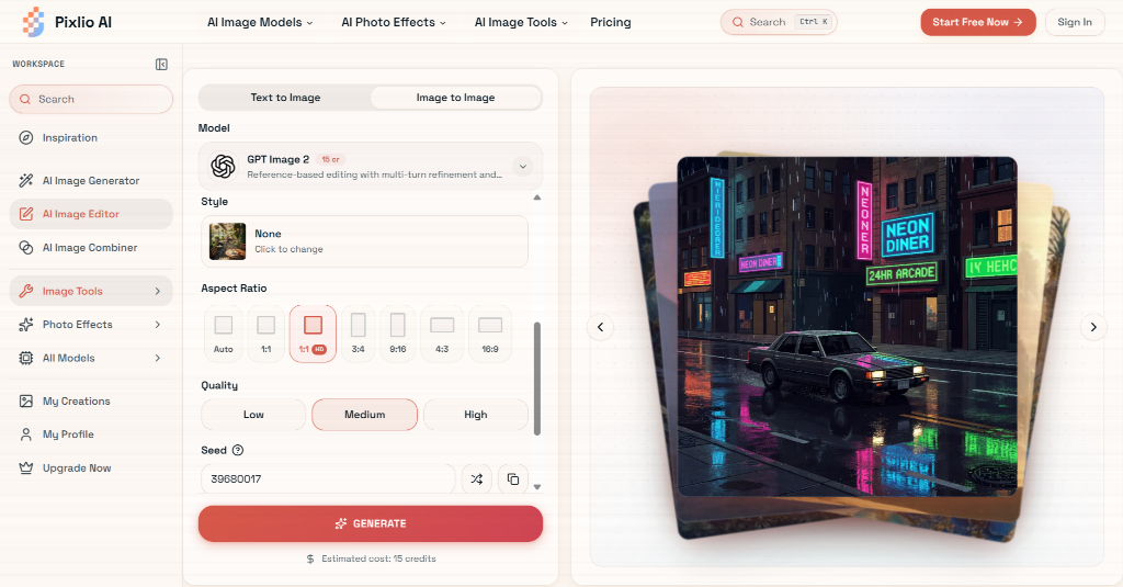
A browser-based AI image editor can help turn those materials into coherent supporting assets without requiring a full desktop editing workflow. Pixlio supports image-to-image editing as well as text-to-image generation, with multiple AI models, aspect-ratio controls, style presets, and JPEG or PNG output.
For a storage article, the practical use is fairly restrained. You might simplify the background behind a product photo, adjust a distracting environment, or create a wide header from a source image that was originally framed vertically. If several versions are needed for an article, social post, and video thumbnail, changing the aspect ratio at generation time can reduce repetitive cropping.
The boundary stays the same: edit presentation images, not the underlying measurement.
Combine hardware and usage context more naturally
Sometimes a single source image does not tell enough of the story. A bare SSD on a white background says little about whether the article is discussing a gaming upgrade, workstation storage, or an external enclosure.
This is where an image combiner can be more useful than a basic collage. Rather than placing two rectangular images side by side, the tool can merge source photos into one scene and work on placement, scale, lighting, shadows, and edge blending. Its guided modes include Product in Scene, Subject into Background, Creative Blend, and an automatic option.
A reviewer comparing an NVMe drive with an older SATA SSD could combine a clean product photo with a realistic desktop-building scene for a feature image. Another option is placing an external SSD beside a laptop in a travel setup when discussing portable storage benchmarks.
These images are illustrations, not proof of performance. A short caption makes that clear, while the real benchmark capture stays nearby as the actual evidence.
Give older hardware stories a visual identity
Not every storage article covers the newest PCIe drive. Retrospectives on early SATA SSDs, hard-drive-era PCs, old benchmark interfaces, or the evolution of consumer storage speeds can benefit from a period-inspired visual style.
A sepia filter is an obvious choice for this kind of content, but a useful implementation needs more control than a flat brown overlay. Pixlio offers Subtle Sepia, Classic Sepia, and Deep Vintage styles, along with controls for warmth, grain, and fade. It also keeps the original and processed image available for comparison.
That makes the effect suitable for archival or nostalgic supporting photography. A photo of an older desktop, a stack of legacy drives, or a workshop scene can receive a consistent historical treatment while keeping recognizable objects and details intact.
The benchmark screenshot itself should usually stay in its original colors. The contrast between an authentic interface capture and a styled supporting photograph can actually help readers distinguish measurement from atmosphere at a glance.

Use visuals to explain, not exaggerate
Good hardware communication does not require every image to be literal, but readers should be able to tell what they are looking at.
A diagram showing a large video file moving between drives can help explain sequential throughput. A scene filled with many small application files can support an explanation of random access patterns. A combined product-and-laptop image can establish the use case before the technical discussion begins.
None of these visuals should imply that a benchmark proves more than it does. A high sequential score does not automatically mean every application will feel proportionally faster, and a polished product image does not say anything about endurance, thermals, or reliability.
The workflow itself is straightforward: capture the benchmark accurately, record the test conditions, keep that evidence unchanged, and use creative tools only where they make the surrounding explanation clearer. Ask a colleague or fellow reviewer to look at the draft and confirm whether the visual treatment implies claims that the data does not actually support.
For storage reviewers and PC enthusiasts, AI image tools work best when they stay in that supporting role. Used carefully, they can make technical articles easier to scan and more visually coherent without asking readers to trade accuracy for presentation.